What is responsive design?
Responsive web design
Naturally you want your website to look good and read clearly at all times, whatever device it is viewed on. For a very long time web pages could only be visited (properly) on computers and laptops, because those websites were built with fixed dimensions. It meant that visiting that same website today on a tablet or a phone would make it look tiny, oversized or out of place. Completely unreadable, in other words. Back then it was still necessary to build two separate websites.
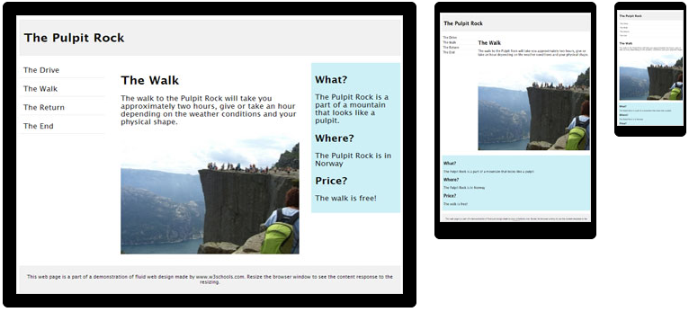
In 2010 a relatively new way of building websites emerged: responsive design. It means that one and the same website displays properly on every device, instead of having to make 2 different websites. As soon as the screen gets smaller the website responds and adjusts its elements. An element that normally takes up the full screen width, for instance, becomes smaller on a tablet screen or even disappears entirely in the mobile version.
At Digital Impact responsive design is taken into account as standard, so your website always displays perfectly on every screen and in every browser.